So a few days ago I went over to the USC games department (yes, it looks like you imagine: arcade machines in the hallway and always someone hopping to class on a pogo-stick in the background) and gave a lecture to their tabletop RPG design class (yes, USC has a tabletop class) on visuals in RPGs.
It was fun and signs point to "they liked it". For the benefit of y'all here are the basic talking points--longtime readers will recognize some familiar takes.
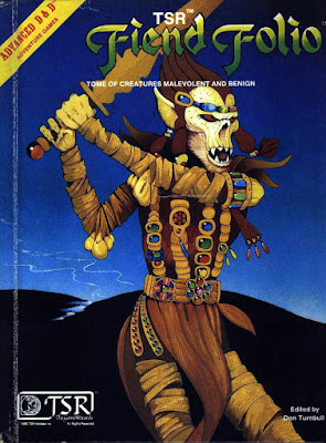 |
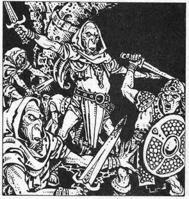
| Anybody recognize this guy? That's right, the Githyanki! Why? He's still around and popular... |
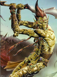 |
| Here he is, still in modern D&D. Why? Because he looked cool on the cover of the book. That's the only reason! How do we know?... |
 |
| Eberron's art had a task to do: make robots ("steel golems") and steampunk stuff look like D&D. And they did it: these folks look like they could be next to a knight or a wizard. Mission accomplished. |
 |
| This guy on the other hand...everyone knows the RIFTS system sucked, but the designs were original, and Siembieda and Long's artwork made sure they felt concrete and toyetic--even if you don't like the art, it's easy to reognize this guy, the psi-stalker, the skull-walker as things specific pieces of IP that other post-apoc and genre-mash games don't have. So the game is still around. |
| Fast forward 40 years, they have a graphic design budget..it still sucks. On the left it takes FOUR PARAGRAPHS to say what a "fighter" is... |
| And say you wanted to make a fighter...you die midgame, try to make a new PC. Half the things you get are here and... |
| Kinda useful tables here in the 5e D&D Dungeon Master's Guid... |
| ...and since these tables aren't grouped together or color-coded I had to draw an arrow to each one along the (disintegrating) page-edges |
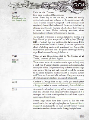
| Fast forward 40 years and surely module design has imp...nope. |
| They even put a page turn right in the middle of a scene. As for how these things link together? A visual map is totally eschewed in favor of more paid-by-the-word lard. |
| Now some good examples of info design: the Call of Cthulhu character gen pages. You can run your whole group through character creation using this spread. |
 |
| This is just me proving that you could fit all of the Keep on the Borderlands on three spreads: one for the Caves, one for the wilderness, one for the Keep, and maybe like one spread w. the treasure on it. You just saved like dozens of pieces of paper. |
 |
| Dr Doom's castle--an excellent FASERIP map. On the right all the info on all the rooms is listed. I've used this as SO MANY different castles. |
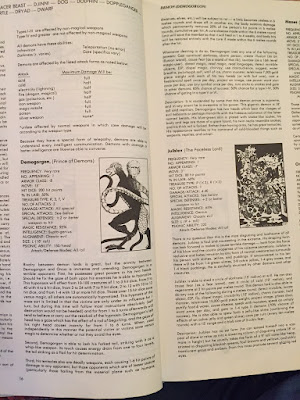 |
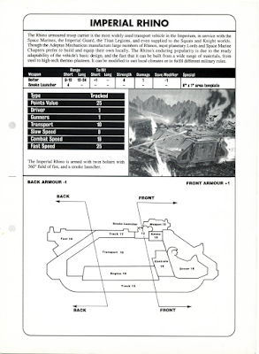
| The Monster Manual format is actually a good pice of design--it acts as its own index and its easy to find things. Its not perfect in its original form, but it was a good precedent. |
 |
| the blue and the red are notes I added to the standard Night's Black Agents character sheet--literally all of the character creation rules for the game can fit on the sheet. |
 |
| Kirin Robinson's wonderful Old School Hack is an example of simple graphic design tools (standard fonts, too) used to make rules clear, accessible, readable and concise |
 |
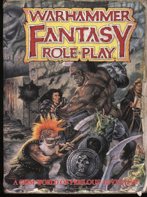
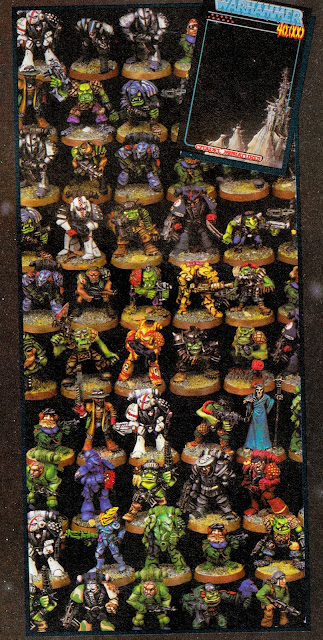
| All over the world, people know how to paint their Chaos warriors all chaosy. How? |
| ...the grimoire-like and aggressive and aggressively-specific aesthetic of the original Realms of Chaos books, that's how |
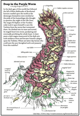 |
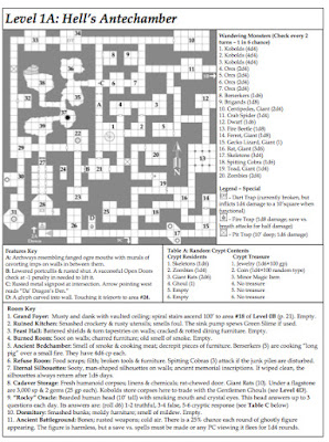
| Luka Rejec's excellent one-page-worm-dungeon. Its missing some detail but how many pages would it take TSR or WOTC to do just this? |
 |
| The Original One Page Dungeon: Michale Curtis' Stonehell. Efficiency is beautiful. Efficiency is art. |
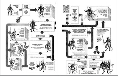 |
| Making a chaos champion looks fun, amirite? |
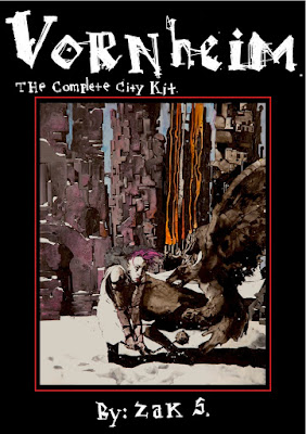 |
| So to walk y'all through the process, I am gonna show you some of my own stuff. Do you all have Vornheim? "Yes, they all have Vornheim, it's on the syllabus" Excellent. These are projects that win design prizes and all it costs is the graphic designer's first-born child. |
 |
| One-spread dungeon. With pictures--maybe you can't read my pictures til you understand the description? It's ok, it's right there. Then you look back and go "Ohhh, it's a piano" |
 |
| Simple graphic solution to keep track of NPCs |
 |
| I actually invented the adventure as I drew. If you're not an artist or graphic designer, having them on from the jump helps. |
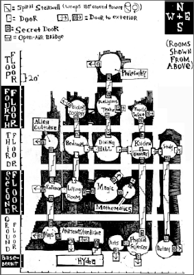 |
| Name of the room on the room--and descriptive. Not rocket science but mainstream games still haven't figured it out. |
 |
| The famous Vornheim die-drop covers |
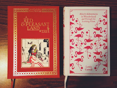 |
| Red & Pleasant Land was a different challenge than Vornheim. Vornheim was about maximizing the info in 64 black-and-white-pages. RPL also needed to feel like a convincingly luxurious object from inside the gamewold. |
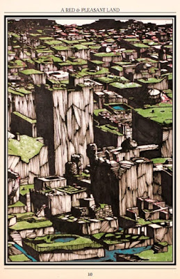 |
| The gameworld itself was built on gamelike principles because Lewis Carrol's fiction was gamelike to begin with. |
| Nearly all the RPL pictures were done on one big piece of board |
 |
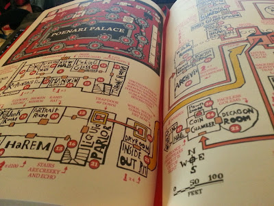
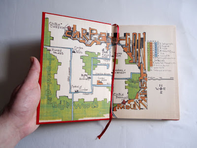
| Reprint the relevant section of map on every page. When there's a diagram, make a full illustration out of it to kill 2 birds with one stone. |
 |
| Simple map, with random encounter solution (different dice) on the right |
 |
| Monster Manual format, basically. We all use this bc it works. |
 |
| Again showing what adventurers here look like--in this case I wanted Connie to show a black girl fitting easily into the setting's western/middle european vibe |
 |
| Jez Gordon's lovely spread-map. I ran adventures off this one spread for 4 sessions. |
 |
| The challenge in Maze was: I wrote short stuff for Maze, but Patrick's prose was long and I didn't want to edit it much |
 |
| The original painting |
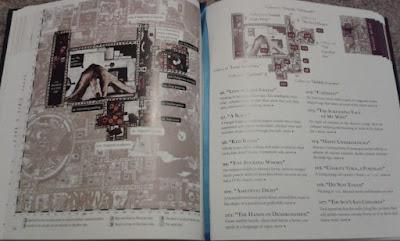 |
| Every picture in Maze is just a blow up from that one painting. The entries have short summaries ont he first spread.... |
 |
| Then longer ones with any extended prose on the next |
| Search the body table where its easy to find. |
| Colorcoded. |
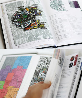 |
| Lovely lovely look at me |
| We used the left over space to repeat useful info to minimize page turns: Search the body table, random encounters for that area, minimap, etc. Nobody complained it was redundant bc it helps. |
| for Frostbitten & Mutilated (now at the press) we wanted a real doom/black metal look. Luka Rejec did the graphic design for us. |
 |
| Same info design imperatives as before but different aesthetics |
 |
| Again, almost all the art fit on one page |
| A WILDERNESS MAP WHERE ALL THE AREA DESCRIPTIONS ARE ON THE MAP! So excited. |
| etc |
| etc |
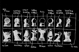 |
| Info design combines with world design and game design--the Amazon chess game is also a divination game |
 |
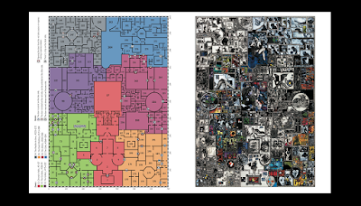
| Whole dungeon fits on the spread, as |
| etc |
 |
| Painters take note I just put a bunch of wet thin white paint over a black background and let it dry and it krink;ed up into a landscape |
 |
| Visual random table. Kelvin Green did it first. |
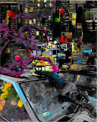 |
| Demon City. I basically said What's the specific thing I imagine happening in Demon City? That image--the one that makes you think the game is a Thing. Paint that specifically. |
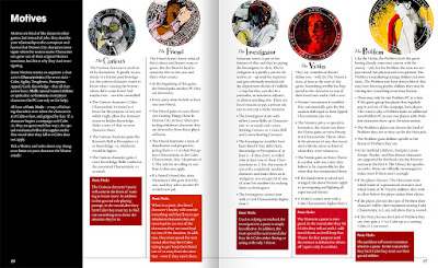 |
| General description of each Motive (class) at the top of each column, character gen rules underneath, during-game panic rules at the bottom. |
 |
| Shawn Cheng's design can take advantage of the fact that, since its a modern setting, the game can use some modern "designy" looks. |
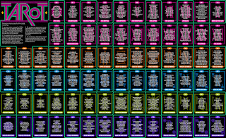 |
| The tarot page doesn't need to be consulted fast--it's sexy and that's what's important. |
 |
| Although all the art is by me, I want to give a range of kinds of imagery because Demon City can do the Kubrick Shining horror or Anime guro or whatever |
 |
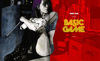 |
| I keep telling Shawn to give my art these vintage-looking designy treatments... |
| I eventually just realized: hey why not paint these patterns right into the pictures and give him a break? |
